Mobile World Congress (MWC) 2024 has come and gone with a flurry of new smartphones and mobile tech. Nothing, a brand that has set itself apart from the rest with truly unique and interesting hardware designs, also revealed its latest phone.
The Nothing Phone 2a is a new budget offering from Nothing following the success of the Nothing Phone 1 and Nothing Phone 2. While I love the aesthetics of the previous iterations of the Nothing Phone, this new one is, well … not as pleasing.
That camera layout is a choice
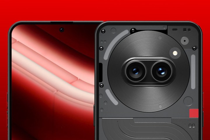
Nothing went with a dual camera layout on its first two phones, as the company has yet to release a triple-lens camera on a phone. With the Nothing Phone 2a, it appears that Nothing will stick with the dual camera layout.
However, the placement of the dual camera system has changed, and it’s an interesting decision. Rather than being vertically stacked in the upper left corner, like most phones, the Nothing Phone 2a switches to a horizontal layout that is centered near the top. The camera module is also in the middle of a circular coil-like object, which has three Glyph LED lights around it.
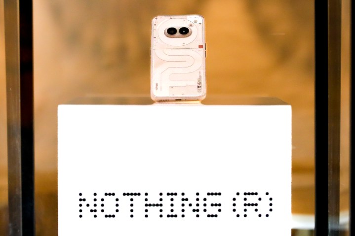
I’m not sure what Nothing was thinking when designing this phone. But how could you not see that this camera module in particular looks a bit — odd? It’s not really the sleek aesthetic that I’ve come to expect from Nothing after its first two phones.
Of course, liking a design is subjective, so while I personally don’t like this dual camera module layout, you may like it or simply not care. At the end of the day, it will still work and take photos, but I just can’t unsee a pig snout on the phone.
It’s a very drastic departure
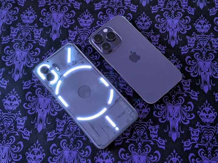
The more I look at the Nothing Phone 2a, the more I dislike it. And it’s not just the camera layout that I don’t particularly care for; it feels like a drastic departure from the sleek aesthetic that Nothing is known for, at least for me.
I was initially drawn to the Nothing Phone because of the sleek design of the first and second iterations. I like seeing what looks like the wireless charging coil in the middle, surrounded by LED light strips, and the original layout of the Glyph interface reminds me of the Apple logo (with that slanted diagonal stem at the top).
But the Nothing Phone 2a? It doesn’t really give me those sleek aesthetics that made me like the brand, even if it is still doing something different from its competitors. I’m not a big fan of that curvy design in the lower two-thirds of the phone underneath the pig-snout camera module.
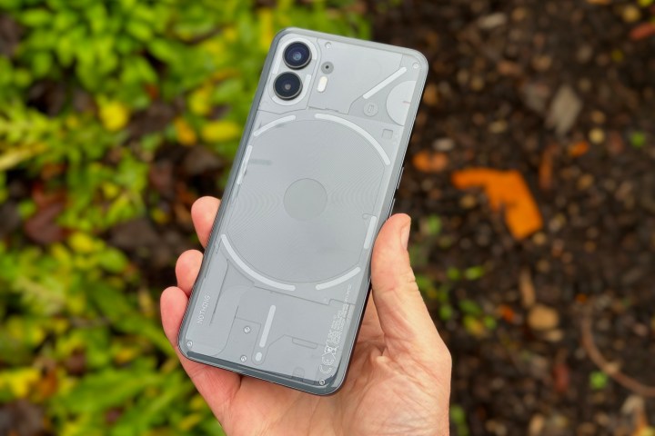
And the lights! That’s one of my favorite things about the Nothing Phones. While the Nothing Phone 2a still has them, it’s just three LED lights, and they’re rather small, only available in the top third of the back glass around the camera.
I’m sure the three Glyph lights on the Nothing Phone 2a will serve their purpose and work similarly to the Nothing Phone 2. But still, just three? I think nothing could have added more, and it would make the whole curvy aesthetic a little more appealing.
Design is subjective
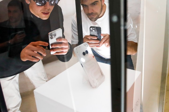
As I said, design is a very subjective thing; while I don’t really care for this new design approach with the Nothing Phone 2a, that isn’t to stop others from liking it.
I’m sure that the Nothing Phone 2a will be a great budget-friendly option for those who want to check out a Nothing Phone. We should also learn a lot more about the phone very soon, with its launch event scheduled for March 5.
I just wish we didn’t have to deal with that pig snout camera design.
Editors’ Recommendations
Leave A Comment
You must be logged in to post a comment.